Squirrel Bingo
Summary
Challenge
Reimagine the classic game of Bingo as an interactive and challenging app with a unique premise.
Role
Interaction Designer
Tools & Methods
Figma, Pen-and-paper, Canva
Timeline
September - October 2023
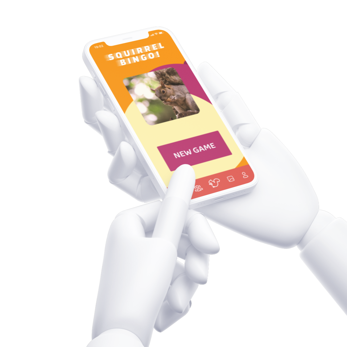
Step 1: Identifying a Need
Does anyone "need" a Bingo app? Um, of course! What is life without fun? The true challenge in this step is identifying a unique Bingo concept that would satisfy a user base of young adults 18-22 in East Lansing, Michigan.
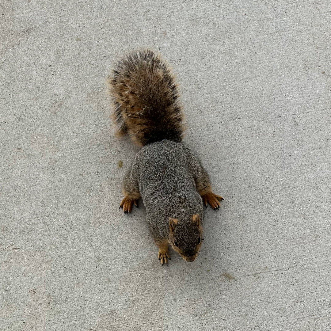
Drawing from my lived experiences and a few informal interviews with the target demographic, I discovered that a common pastime included watching and playing with the beloved squirrels of Michigan State University's campus.
Through continued observation, I noticed that while the squirrels of MSU were well-loved, they were sustained by a less-than-natural diet of college student leftovers and litter. This observation provided a second purpose for my Bingo concept: education about the squirrels that MSU students adore.
Step 2: Setting Up
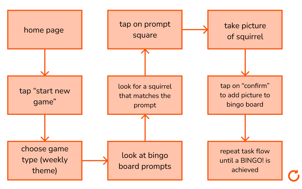
After identifying a unique purpose and idea for my Bingo app, I developed a concept statement that served as the compass for the remainder of the build. Based on my concept and the identified needs, I developed a user need statement and taskflow that would serve as a blueprint.
Concept Statement
Squirrel Bingo is a fresh and exciting app that combines the worlds of bingo and squirrel-watching. This app hosts a weekly bingo that users can fill out by finding the squirrels that correspond with the prompt and snapping a picture. When a user completes a row horizontally, vertically, or diagonally, they will achieve BINGO! and their squirrel photos will be posted to the community board so everyone can see the cute squirrels! With each BINGO!, users will also receive an “acorn” which will tell them a cool squirrel fact of the day.
User Need Statement
A college student (who is scared of squirrels) needs to find a fun way to pass the time and get used to their natural surroundings in order to feel more comfortable on campus.
User Task Flow
Step 3: Wireframes
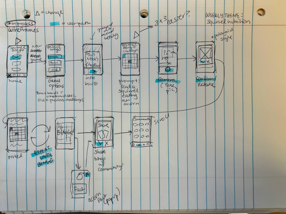
Using the initial task flow, I created low and medium-fidelity wireframes to visualize how a user will navigate the app. The medium fidelity design, developed in Figma, considered user interactions in addition to representing the task flow.
Low-Fidelity Wireframes
Medium-Fidelity Wireframes
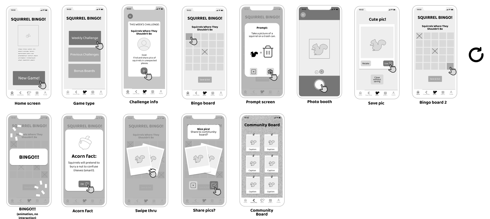
These wireframes were presented to the client as a mid-project check-in. The client requested a feature to demonstrate how many players were using the app in the task flow. Once this request was implemented, a design system was created for the app to prepare it for prototype development.
Step 4: Design System
Before translating the medium-fidelity wireframes into the final prototype and mockups, I created a design system that would help keep my models consistent and visually appealing.
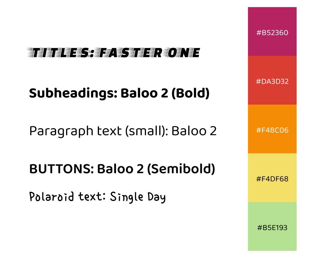
The design system provided a guideline for typeface and color. The selected fonts were intended to reflect an air of playfulness and competition that are associated with mobile games.
The color palette I developed was based on the autumn season when squirrels are most active. I also considered and tested colors for accessibility.
Step 5: Coding the Prototype
Bringing my static designs to life was the most time-intensive and enjoyable part of the project. In this final stage, I used Figma's prototyping tools to create interactive and animated components of the project. The frame below contains all of the frames in the final deliverable.
Final Deliverables
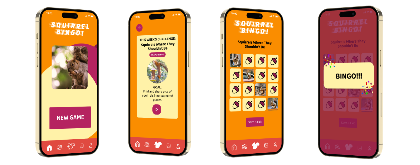
Using all of the elements from each stage of the project, I created two final deliverables to represent Squirrel Bingo: static high-fidelity mockups and an interactive Figma prototype.
Mockups
Prototype
Use this interactive Figma frame to play a game of Squirrel Bingo. Hint: Click the first acorn on the bingo board.
Conclusions
This project spanned two months and served as development for a detailed design process, branding, and prototyping. Squirrel Bingo helped me hone my ability in programming animations and interactions on Figma, a platform that is widely used by UX designers today. This project was also an exciting opportunity to develop something that users like me can enjoy.
AI Transparency Statement
Canva AI was used to develop four squirrel pictures that appear on the camera and bingo board frames of the final deliverable. I did this to experiment with the tool and to compare it with stock images of squirrels that appear on other parts of the deliverable. No other AI use occurred during the development of this project.
Back to Top