MSU Digital Library Sign Renovation
Summary
Challenge
Evaluate and redesign digital library signs at MSU using a variety of UX research techniques.
Team
Annika Hauser-Brydon, Lisa Chai, Katie Dykema, Jessica Nguyen
Role
UX Researcher
Tools & Methods
Figma, Google Suite, Pitch, User Personas, Heuristics, Competitor Analysis, Field Study
Timeline
January - May 2023

Step 1: Identifying a Need
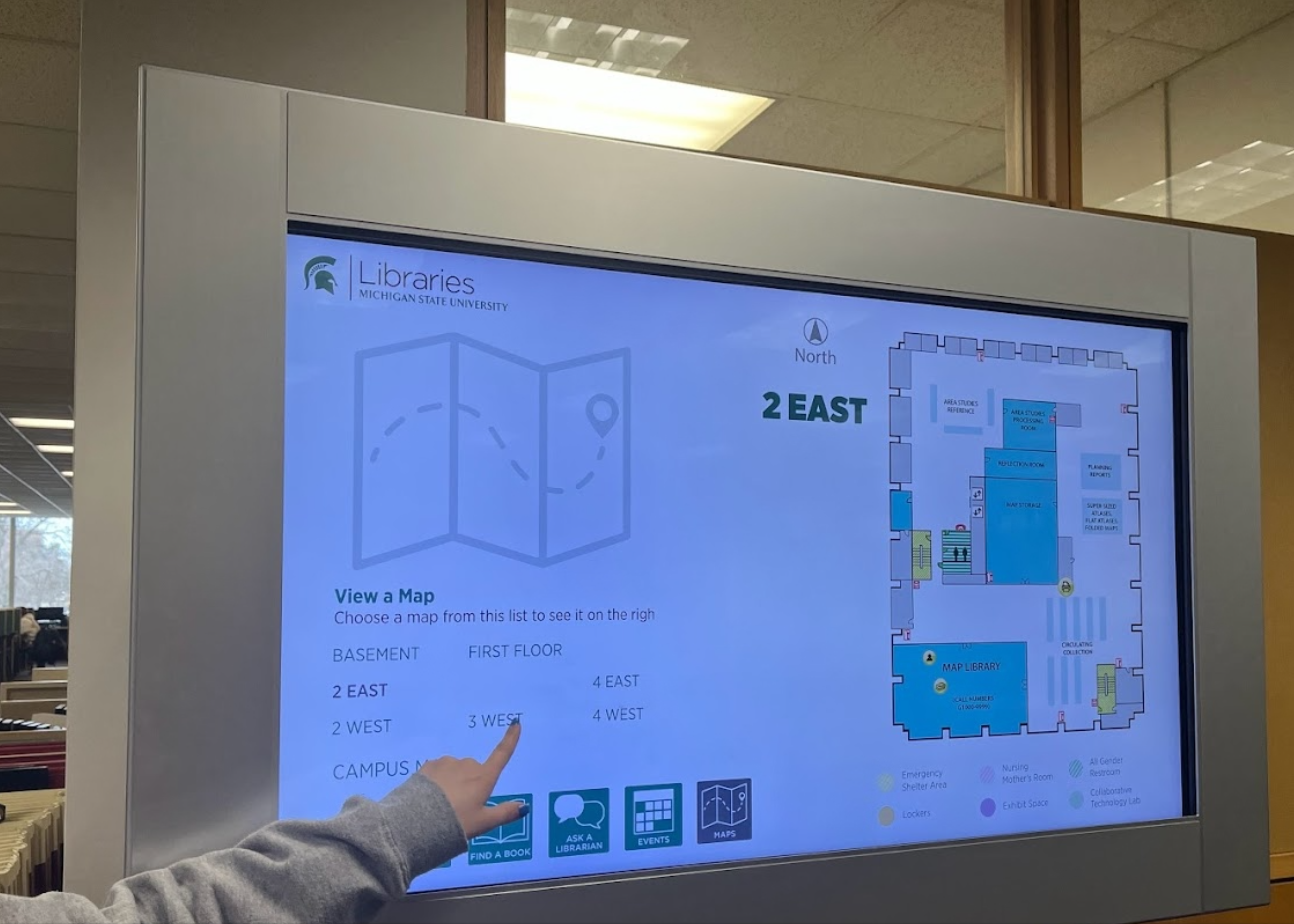
In January of 2023, I was assigned to work with a team of four to update the digital library signs at the Michigan State University main library. Our client, a staff member who had worked on the original design, stated that she had concerns about the usability of the digital layout. This was confirmed by our initial informal observational study - library users struggled to engage with the signs or didn't use them at all.
The usability of these digital signs is vital to the library. They contain maps, staff details, book listings, and other key information that library users require. They also help reduce librarian workload by providing simple but important information. My team and I recognized the impact of these signs and developed a comprehensive research plan to identify core problems and solutions.
Step 2: Research
Three research methods were employed to gather data for the client: heuristics, field study, and competitor analysis. These methods were chosen to gain a better understanding of the structure of the library signage and how it can be improved.
Heuristics
Using Nielsen's 10 Heuristics for interaction design, my team and I evaluated the current digital library signs to determine successes and shortcomings. In this evaluation, we discovered that accessibility, consistency, and redundancy were issues throughout the signs. We concluded that these issues likely contributed to the navigational issues users were facing. Based on these results, we developed a set of recommendations to improve the signs. Read the full report below.
Field Study
Next, my team and I conducted a field study to collect data on how users interact with the library signs in real time. Three random library patrons were asked to complete four tasks with no guidance from the test facilitator. To reduce bias, our team rotated facilitator, observer, and recording roles. This exercise provided more insight into the previously identified problem areas. Specifically, it revealed that users struggled the most with Task 3, finding a book, a clear issue for a library sign. Read the full report below.
Competitor Analysis
The final phase of field research we conducted was the competitor analysis. We evaluated the digital signage of three competitors to compare features and identify ways to improve the features of the MSU library signs. We found several accessibility and notification features that we thought could be useful on the library signs. Read the full report below.
The combined results of this research yielded insights that would aid our team in developing the digital sign redesign. Below is a summary of the results.
User Pain Points
- Physical interactivity - All of the library signs we collected data on lacked adequate pressure sensitivity which hindered their overall responsiveness. Though this cannot be visually represented in a redesign, our team wanted to highlight the importance of improving pressure sensitivity for better accessibility and functionality.
- "Find a Book" Functionality - Our field study revealed how users struggled to navigate the "find a book" function.
- Hierarchy - Through our heuristic and competitor analysis, we found weaknesses in the the hierarchy of content, which presented users with roadblocks as they attempted to navigate the system.
Recommendation Highlights
- Improve Touchscreen Responsiveness
- Merge "Find a Location" and "Map"
- Redefine Hierarchy
Step 3: Desiging Solutions
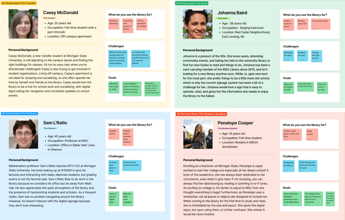
Before the final designs were created, user personas were made based off of the expected users of the digital library signs. Each team member contributed one persona. Three of the personas are related to the university, while one is a community persona. The personas were created this way to reflect the variety of people in East Lansing who interact with MSU Libraries. These personas became useful tools when developing the final prototype.
User Personas

Final Deliverables
Using the collected data, our team collaboratively developed new interfaces for the "Find a Book," "Maps," "Ask a Librarian," and "Events" pages of the library signs. Below is a carousel that includes our study results and final designs. These were presented to the client for feedback.
Conclusions
Paired with the design solutions above, it was recommended that the physical responsiveness of the digital library signs be improved alongside their structural hierarchy. The data and solutions were well-received by the client. This project provided me the opportunity to work closely with a UX team on an intensive project and helped me to increase my proficiency in different UX research techniques. As a result, I am a stronger designer and teammate.
Back to Top