MSU Student Information System
Summary
Challenge
Create a more visually engaging and user-friendly interface for the MSU Student Information System (SIS).
Team
Annika, Rachael, John, Diallo, Kennedy
Role
UX Designer
Tools & Methods
Figma, Google Suite, Zoom, Interviews, Black Hat Session, Survey
Timeline
October - December 2022
Step 1: Identifying a Need
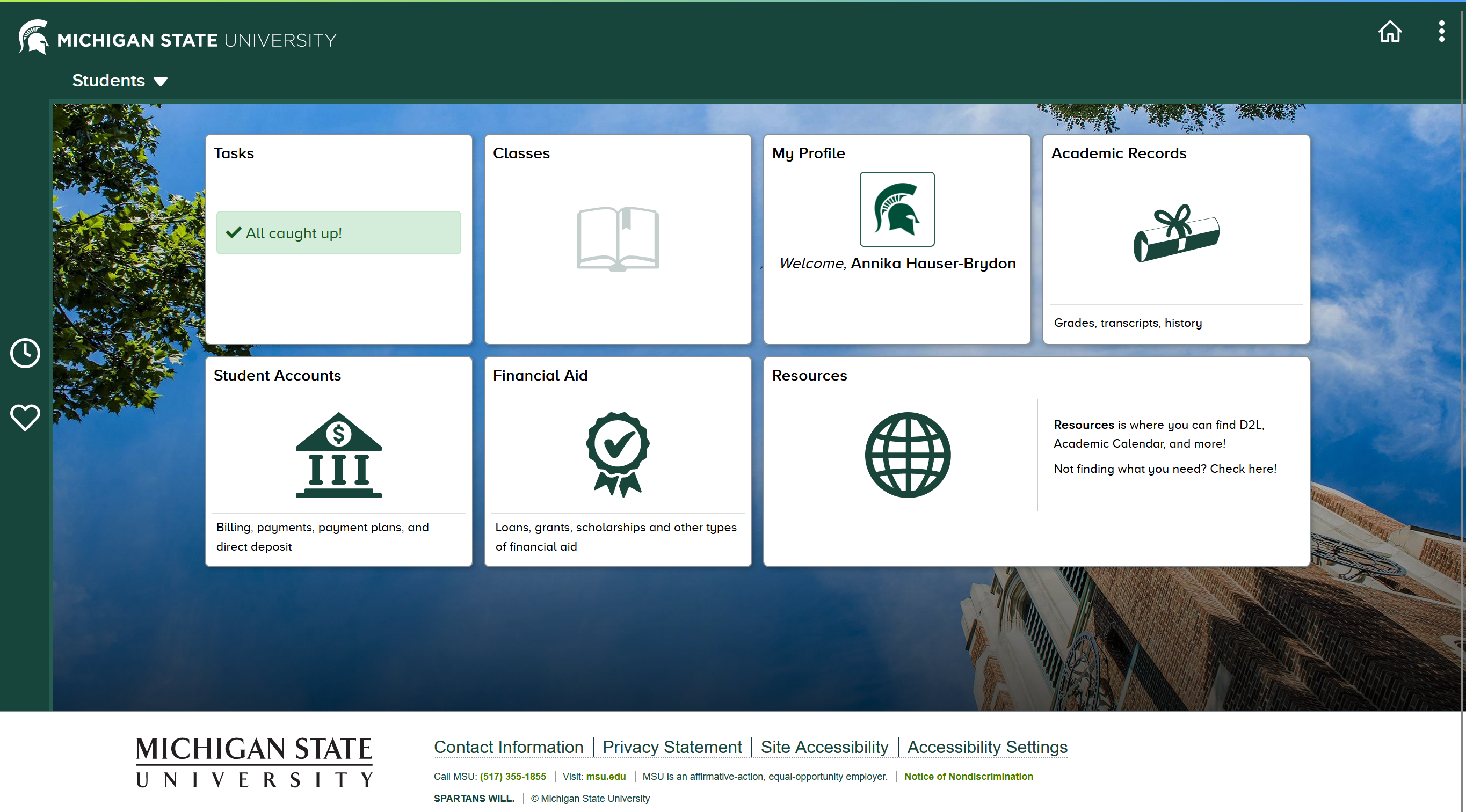
An academic advisor in the College of Arts and Letters reached out to request a redesign for the MSU Student Information System (SIS). The MSU SIS interface at the time of this project was implemented in 2021 when I first enrolled as a student. I had never used the previous interface, but through personal experience and hearing both staff and peer complaints, it was clear that the "update" was a source of frustration.
To determine the focus of the project, we first conducted an in-depth client interview which revealed that the advising and enrollment sections were pain points worth investigating for research and the redesign.
Step 2: Research
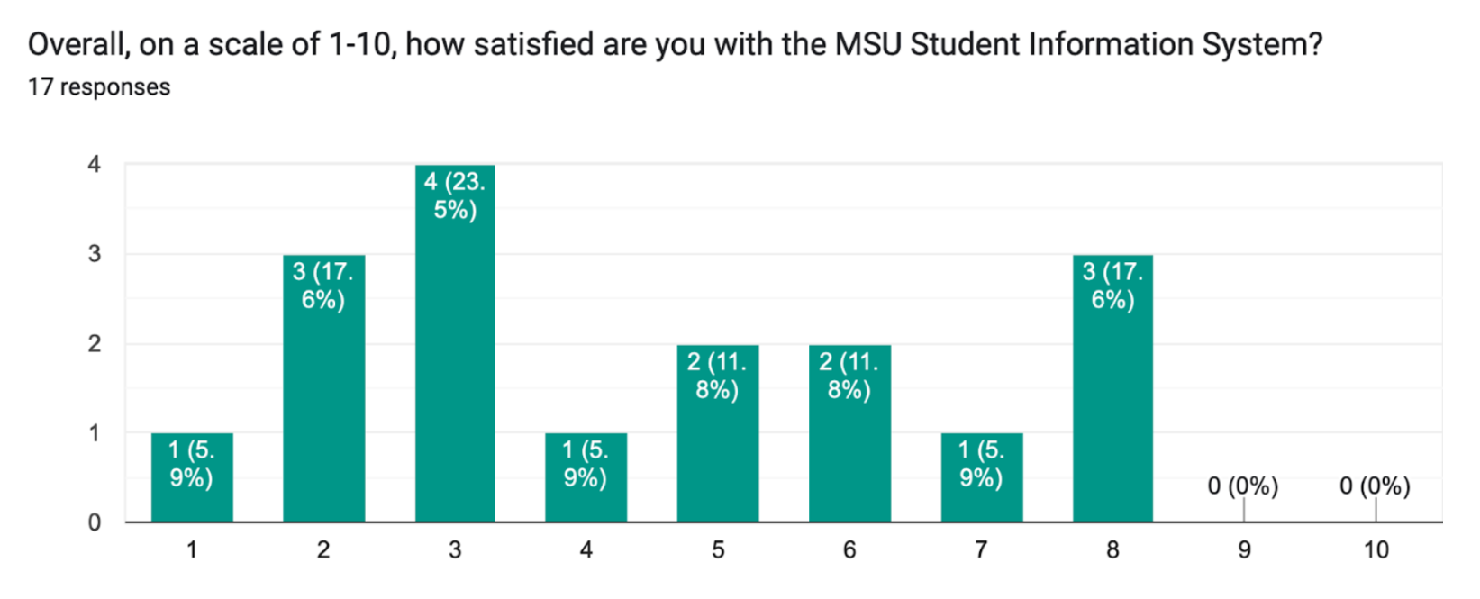
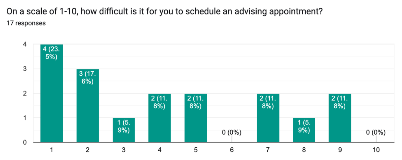
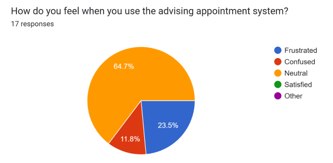
Over a few weeks, our team investigated the pain points of the SIS interface through a series of surveys and guerilla interviews with undergraduate students at MSU. Below is a collection of survey results.
Overall SIS Rating
Adivsing Rating
Student Perception
Student Qualitative Responses
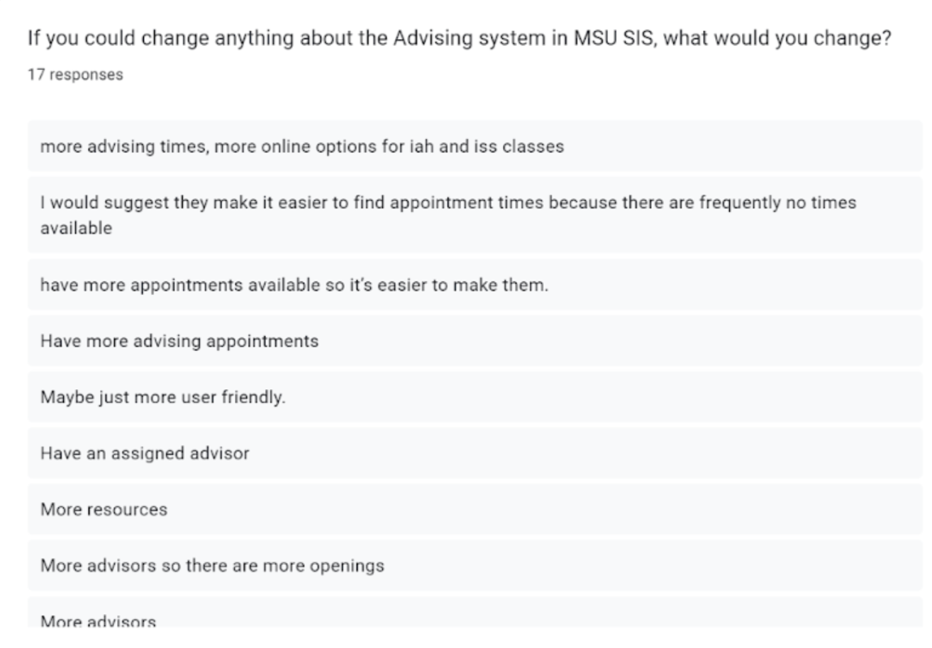
The student survey found that no student had positive associations with the SIS and that they had plenty of ideas about ways to improve the advising process. The guerilla interview results presented similar results. The research conducted made it clear that students were not only confused by the student but also put off by it. Similar to our client's complaint about the “coldness” of the SIS, students felt that the advising process was not only not human-centered but also impersonal.
Step 3: Ideation & Wireframing
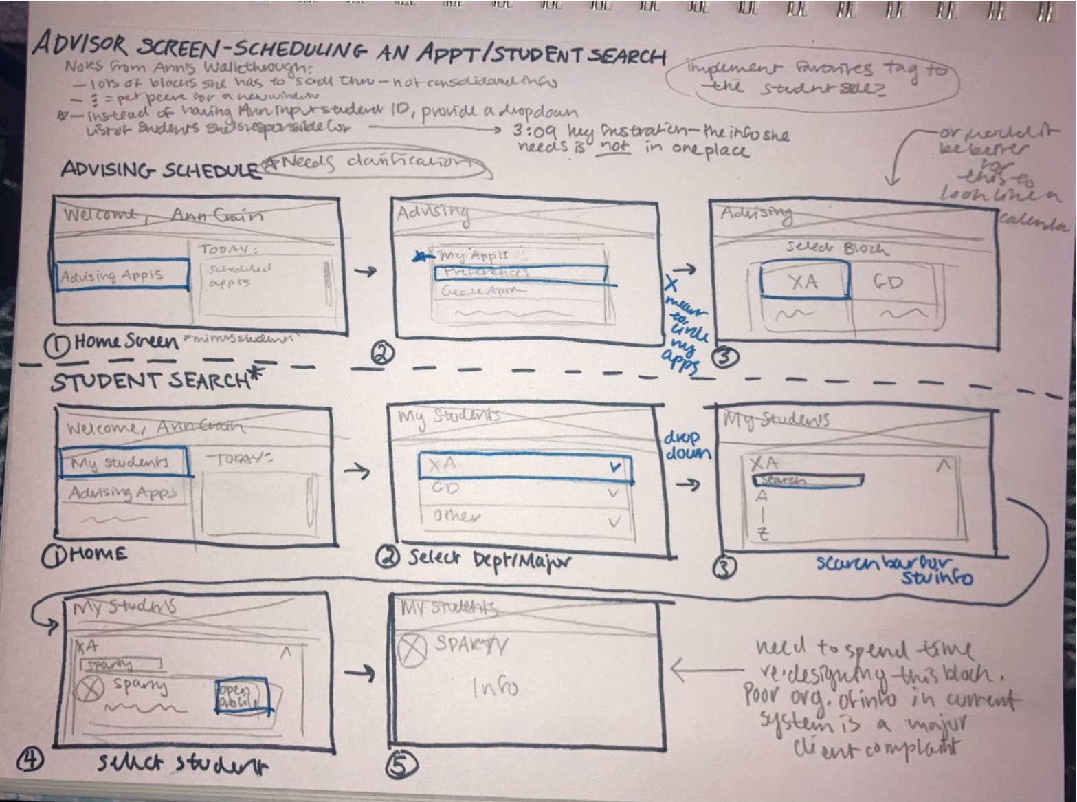
As the main designer on this team, it was my job to manage the design-heavy parts of this project. To get started, I collected the information I needed from the various surveys and interviews conducted. I also took specific notes from the client's walkthrough video of her view of SIS, to see what specific design problems she encountered. I combined all of this information into a design brief that I shared with the rest of my team.
I used the design brief as a checklist of things to include in my early concept sketches, which can be seen below. I created three potential task flows in total: one for advisor scheduling from the perspective of the advisor, a student search process (for advisors), and finally an appointment scheduling process from the perspective of a student.
Advisor Screen Concepts
Student Screen Concepts
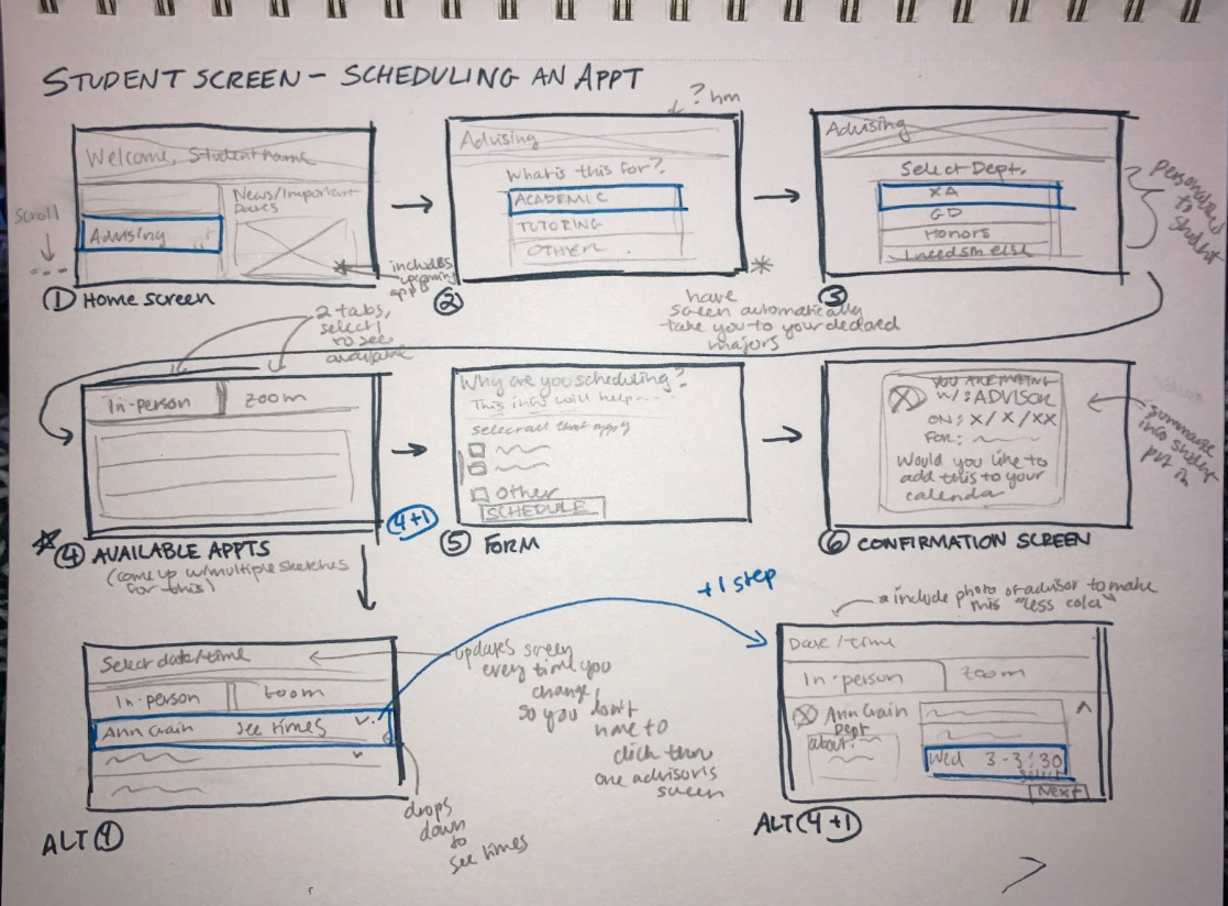
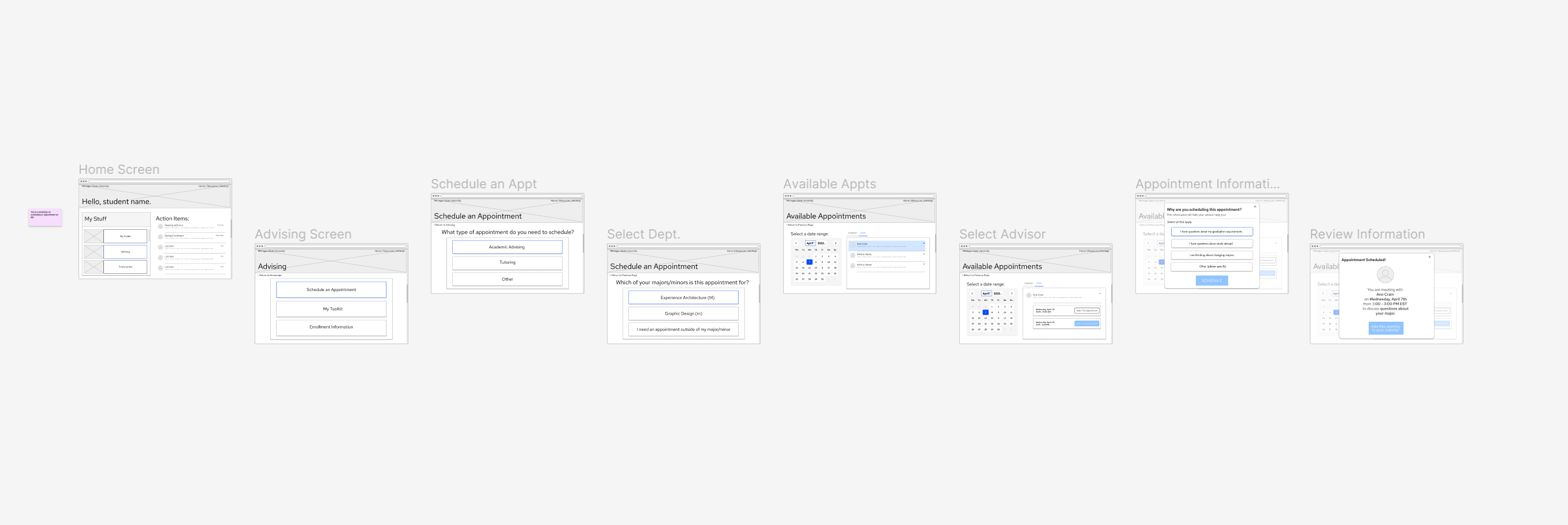
From these sketches, I built a medium-fidelity task flow for the student screen concepts in Figma.
Full Student Screen Task Flow
Step 4: Feedback
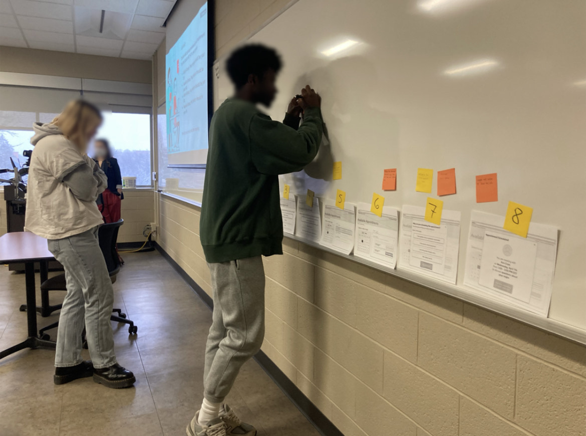
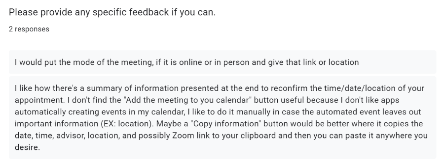
To assess the new design that I created, my team and I asked fellow UX designers and SIS users to evaluate the design. One test involved putting all design ideas on display and letting users leave specific feedback on sticky notes next to the frame they had criticisms for. Feedback was also collected via a qualitative survey sent out to MSU students. This was a crucial step in determining what needed to be fixed within the wireframe.
In-Person Feedback Session
Feedback Survey Results
Final Deliverables
Due to the time constraints for this project, high-fidelity mockups were not requested. Instead, revised medium-fidelity wireframes were presented to the client, with proposed next steps to continue testing and development.
Conclusions
In terms of technical skills, this project helped me practice techniques I hadn't had the opportunity to use before. Specifically, I got the chance to create and test wireframes on real users. Through this project, I was able to completely reimagine a process and see what users (who would genuinely be using this redesign) think of it. I was also able to test out new data collection techniques and apply the results to my designs. I will carry the skills I developed here to my career as a UX Designer.
Back to Top